Subbly Website Builder
Adobe Photoshop
Adobe Illustrator
Research: Creating overall visual aesthetic.
Development: Using Subbly web builder.
Testing: Ensuring the design is user-friendly and functions correctly on different devices.
2023: Redesign initiated with a focus on UX feedback and user-centered updates.
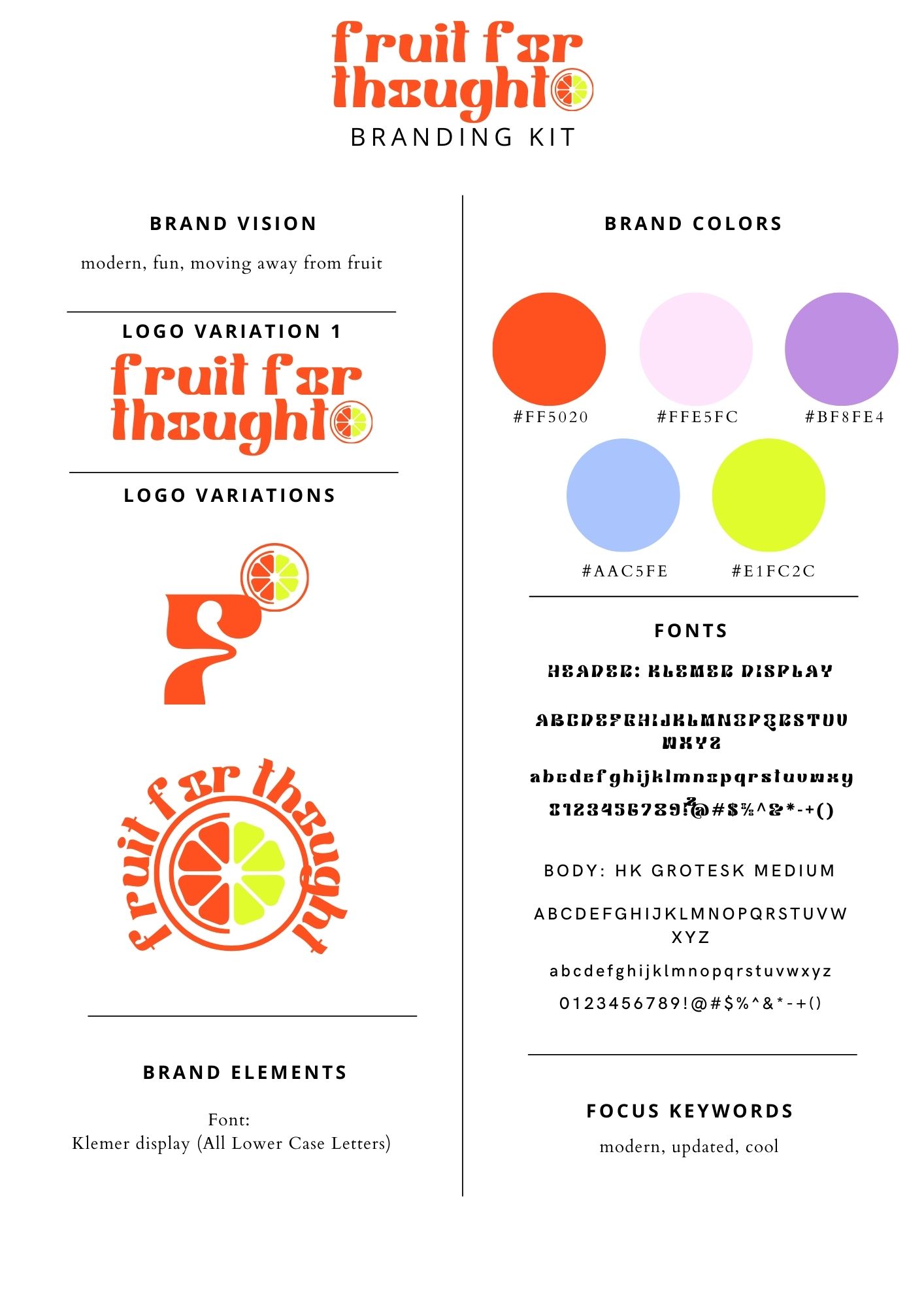
Redesign suggestion Brand Kit and Visual Identity.
Subbly Builder: Customized to incorporates design elements.
Documentation: Instructions or guidelines for maintaining and updating the theme.


During the website redesign project for Fruit For Thought, I identified an opportunity to refresh the brand's visual identity. My proposal included:
-A modernized logo that maintained the brand's playful essence while improving scalability and recognition
-An updated color palette to enhance visual appeal and better represent the vibrant nature of the product
-New typography choices to improve readability across digital platforms
-Cohesive brand guidelines to ensure consistent application across all touchpoints
This rebranding aimed to elevate Fruit For Thought's market presence, appeal to a broader audience, and create a more cohesive and engaging brand experience.
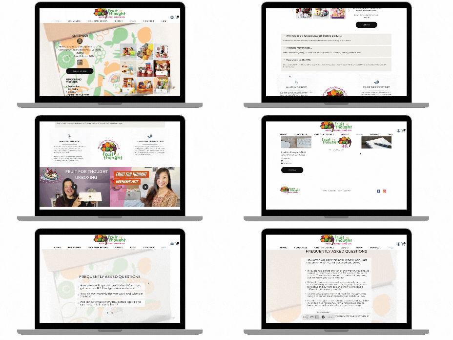
The Fruit For Thought website features a clean and visually appealing design that reflects the brand's playful and vibrant identity.
The UI incorporates
• Color Palette: A cheerful and fruit-inspired color scheme that changes with each month's theme, creating a fresh and engaging look.
• Typography: Easy-to-read fonts that balance whimsy and professionalism, enhancing the overall user experience.
• Imagery: Product photos and lifestyle images that showcase the monthly themes and contents of each box
User-Friendly Features
The website offers several user-friendly features to enhance the subscription experience.
• Subscription Options: Clearly presented subscription plans, including month-to-month, 3-month, 6-month, and 12-month prepaid options.
Theme Preview: A section highlighting current and upcoming monthly themes, allowing users to anticipate future boxes.
• Product Showcase: Detailed information about past boxes, giving potential subscribers an idea of what to expect.
• Easy Navigation: Intuitive menu structure for seamless browsing through subscription options, past boxes, and FAQs.
Unique Selling Points
The UI design emphasizes Fruit For Thought's unique selling points
• Monthly Themes: Each box features a different fruit or food-inspired theme, prominently displayed on the website
Artisanal Products: Highlighting the handcrafted and carefully curated nature of the box contents.
• Sensory Experience: Emphasizing the multi-sensory unboxing experience through product descriptions and customer testimonials.
By focusing on these elements, the Fruit For Thought website creates an inviting and user-friendly platform that effectively showcases its unique subscription box offering and appeals to its target audience of self-care enthusiasts and gift-givers.
