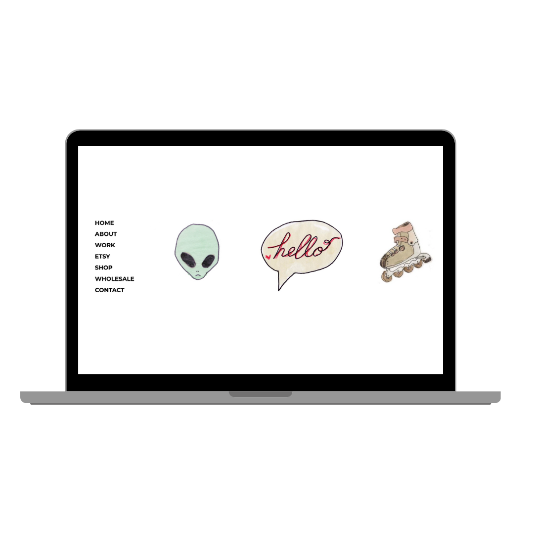
Redesign of my portfolio showcasing my freelance work and creative ventures, seamlessly linking to my online presence
Lo-Fi Wire-frames
Figma
Photoshop
HTML/CSS
Designer: Overall visual aesthetic and user interface.
Strategist: Developed project's goals, target audience, and applied UX feedback.
2015: Initial creation of the portfolio using Photoshop and basic HTML.
2024: Redesign initiated with a focus on UX feedback and user-centered updates.
Wireframes and mockups of the website UI.
Figma Prototype demonstrating the website's functionality.
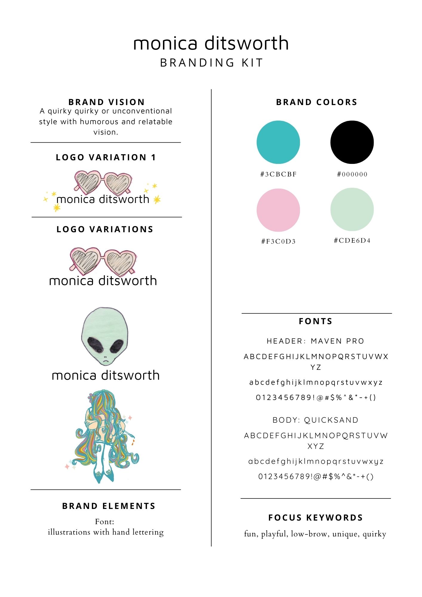
Brand Kit and Visual Identity.
User testing results and recommendations.
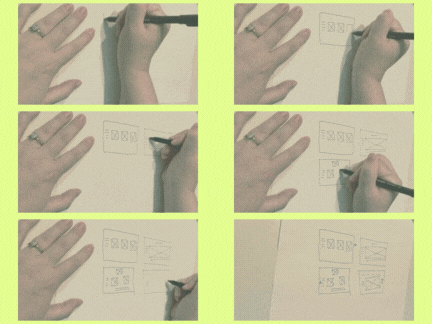
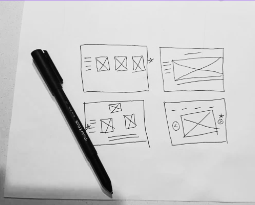
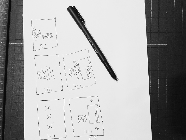
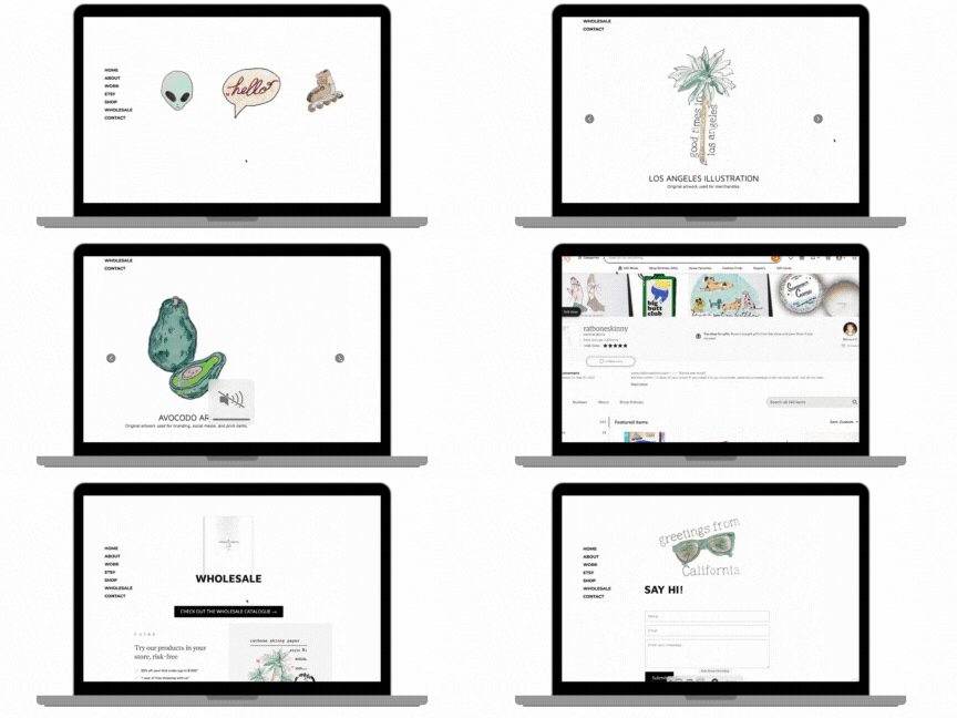
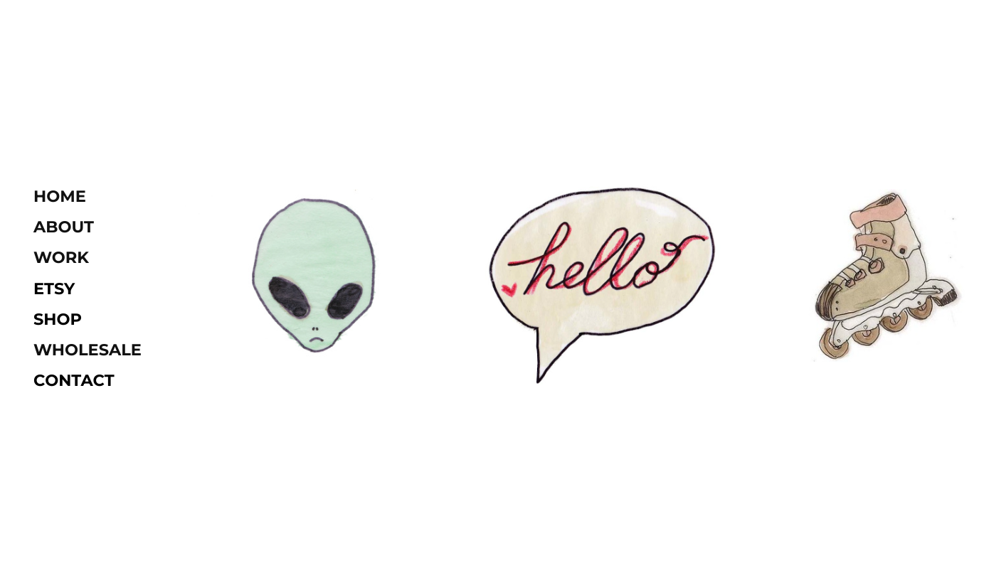
Combined Gestalt design principles to include consistent elements and clear focus.
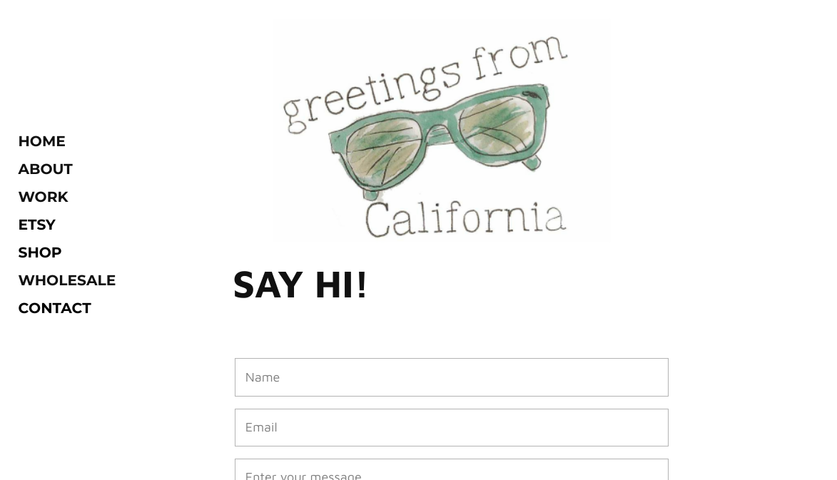
The minimalist design has simplistic, clean lines, to focus on essential illustration and design elements.
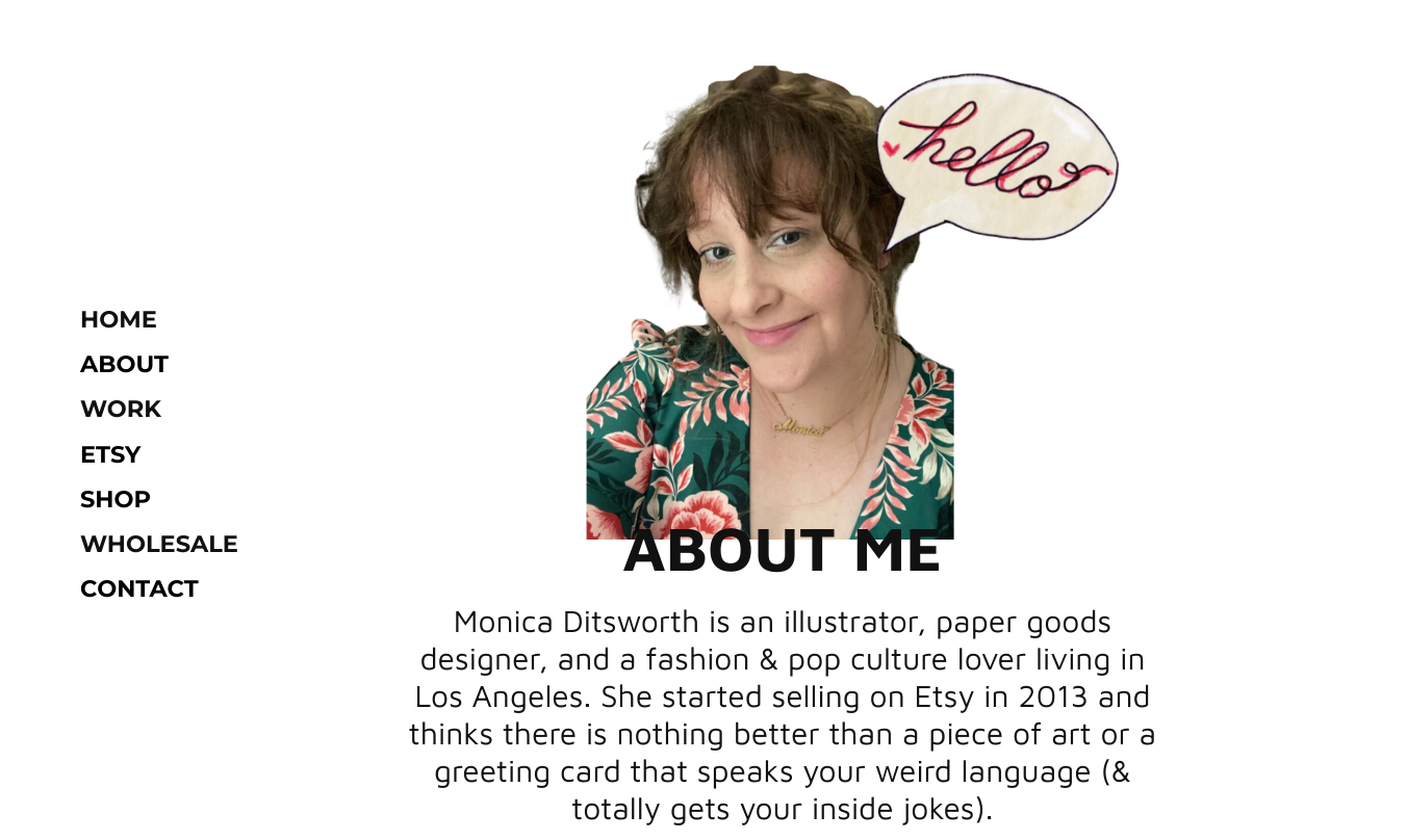
Maven Pro, a sans-serif font, was used for its neutral characters and minimalist aesthetic.
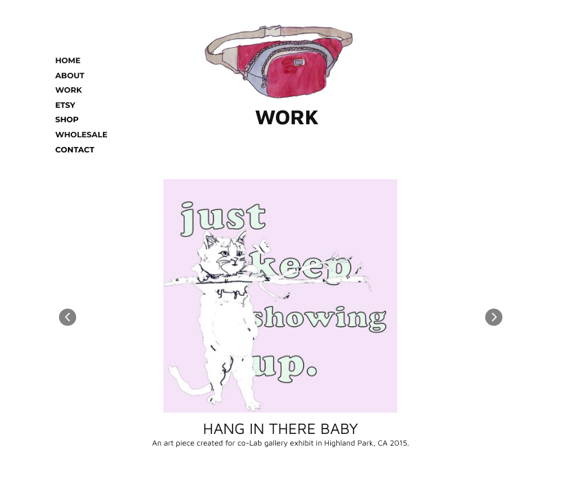
By focusing on the art and my projects, I eliminated unnecessary clutter and distractions, allowing the artwork to take center stage.
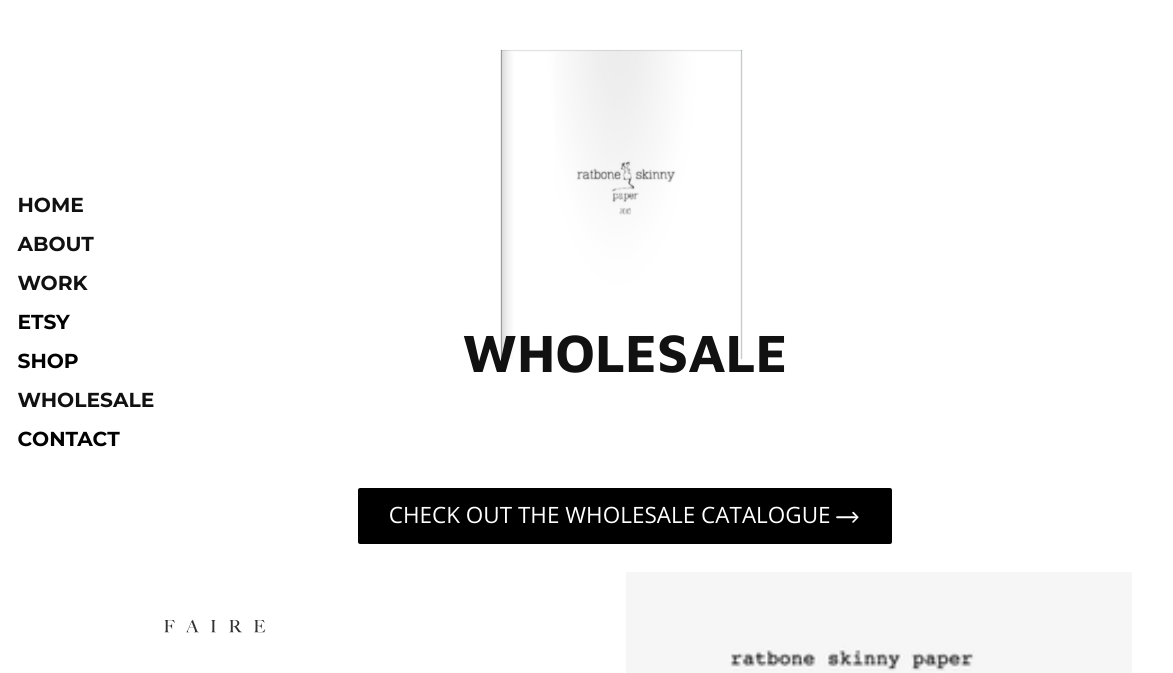
The judicious use of whitespace creates a sense of balance and helps to emphasize the key elements of the design.
