Paper Wireframe
Figma
Shopify Theme Editor
Adobe Photoshop
Adobe Illustrator
Research: Defining the brand's identity, target audience, and competitors.
Design: Creating wireframes, mockups, and the overall visual aesthetic.
Development: Using Shopify's theme editor.
Testing: Ensuring the design is user-friendly and functions correctly on different devices.
2016: Initial creation
2024: Redesign initiated with a focus on UX feedback and user-centered updates.
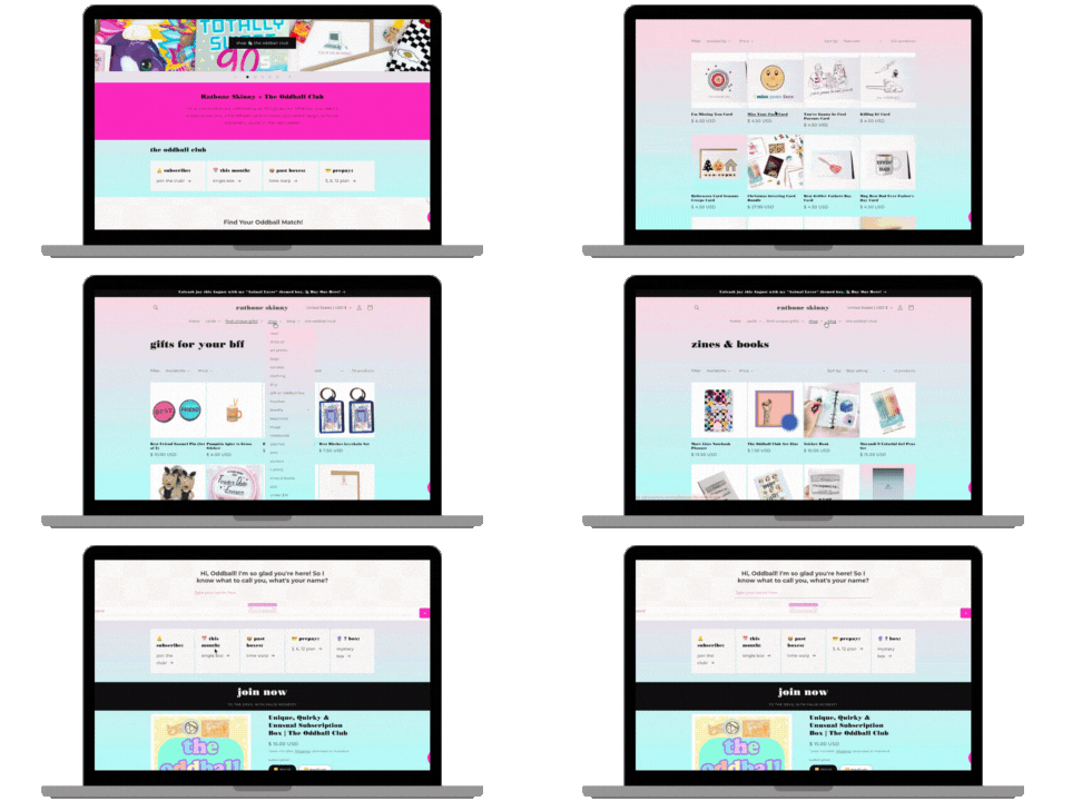
Low-Fidelity Wireframes of the website UI
via Figma.
Brand Kit and Visual Identity.
Shopify Theme: Customized to incorporates design elements.
Documentation: Instructions or guidelines for maintaining and updating the theme.
Integrating the e-commerce functionality with the desired website design and branding proved to be more complex than anticipated.
To overcome this challenge, I worked to identify the best approach for integrating the Shopify platform with the branding to balance functionality with visual appeal and implemented a solution with Shopify's built-in features.
By successfully integrating e-commerce, I was able to provide a seamless shopping experience for my users and increase our online sales.


Ratbone Skinny's visual branding is characterized by its geometric typography and bold color palette. The combination of Düsseldorf's geometric appearance, Bondi Poster's impactful forms, and Montserrat's versatility creates a cohesive and modern aesthetic. The color scheme, featuring a base of black and white with vibrant pops of color like deep pink, evokes a sense of whimsy and fun. High-quality product photos with flat lay compositions and bold colors further enhance the brand's distinctive visual style. This combination of elements creates a memorable and engaging visual identity that aligns with Ratbone Skinny's overall brand positioning.
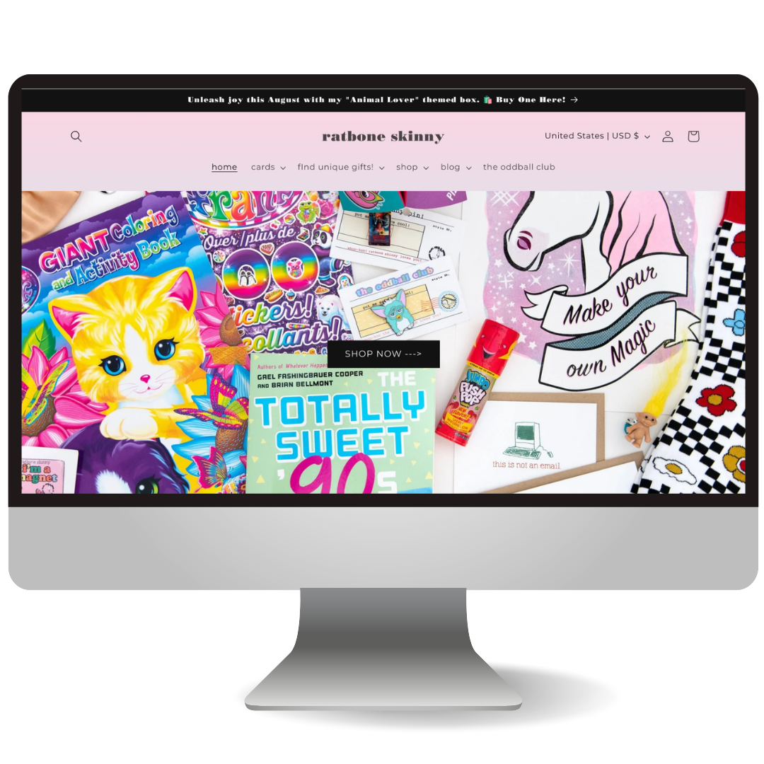
Ratbone Skinny's optimized website features a captivating full-width image carousel with ambient animation at the top, highlighting featured products and collections. Unique call-to-action buttons overlaid on the images encourage user engagement. The clear and intuitive menu system guides shoppers effortlessly to desired information.
To maximize user engagement and potential conversions, I strategically placed the Oddball Club subscription box link at the end of the navigation bar. This leverages the Serial Position Effect, a psychological principle that suggests people tend to remember the first and last items in a series better than those in the middle. By positioning the subscription box link at the end, I aimed to increase its visibility and encourage users to explore this unique offering.
I carefully considered Information Architecture (IA) when designing the navigation bar. By categorizing gift options into 'Find Unique Gifts,' divided into 'By Theme' and 'By Person,' I created a user-friendly structure that simplifies the shopping process. This approach enables customers to easily discover items within specific niches like 'foodie' or 'true crime and horror.' By prioritizing IA, I've developed a navigation system that not only guides users but also encourages exploration and discovery.
The minimalist and clean layout focuses on showcasing high-quality product images in the best possible light. This design choice enhances the overall shopping experience and emphasizes the brand's commitment to quality
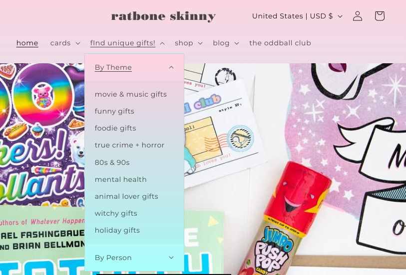
By carefully considering IA,
I created a navigation system
that not only guides users but also
encourages them to explore and
discover new products.
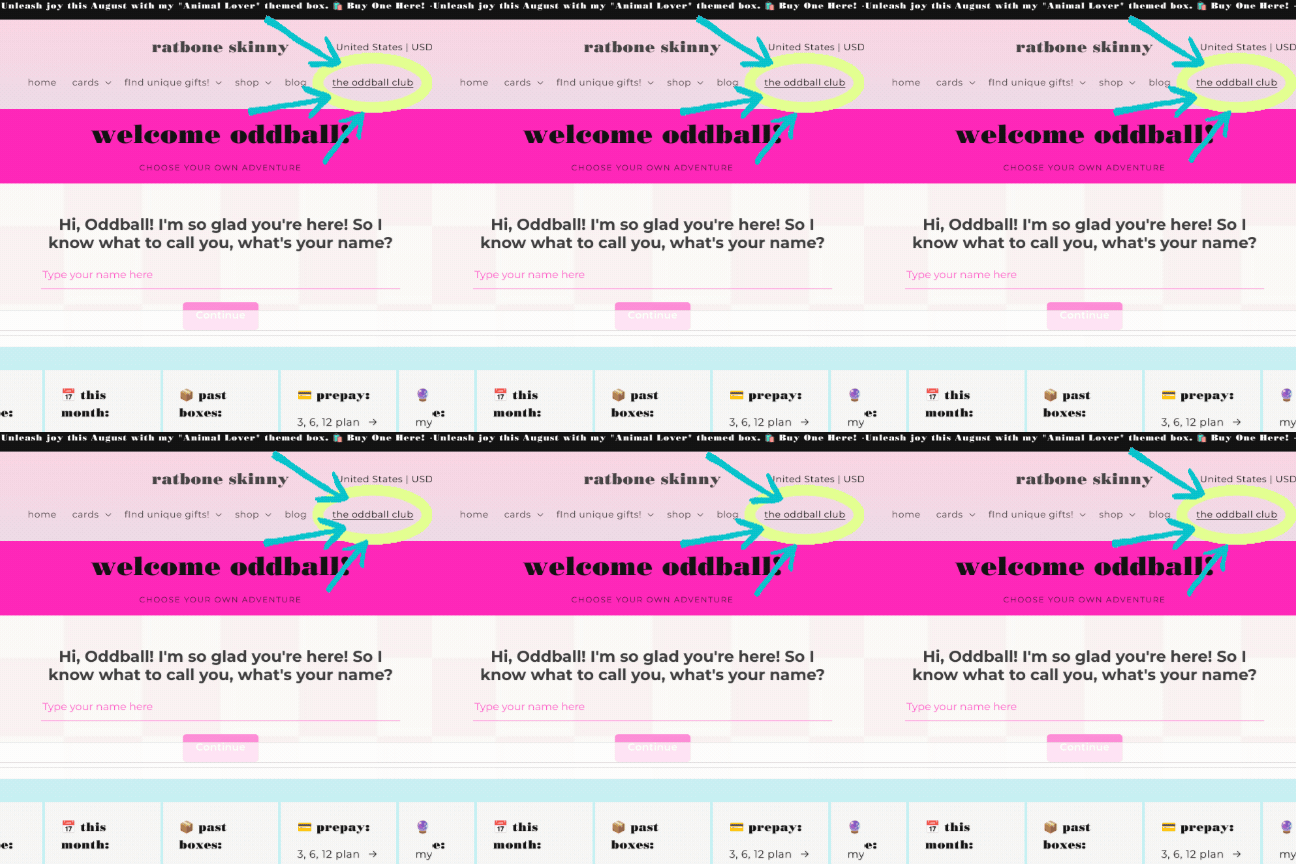
I strategically positioned the box
link at the end of the
navigation bar to maximize
user engagement.
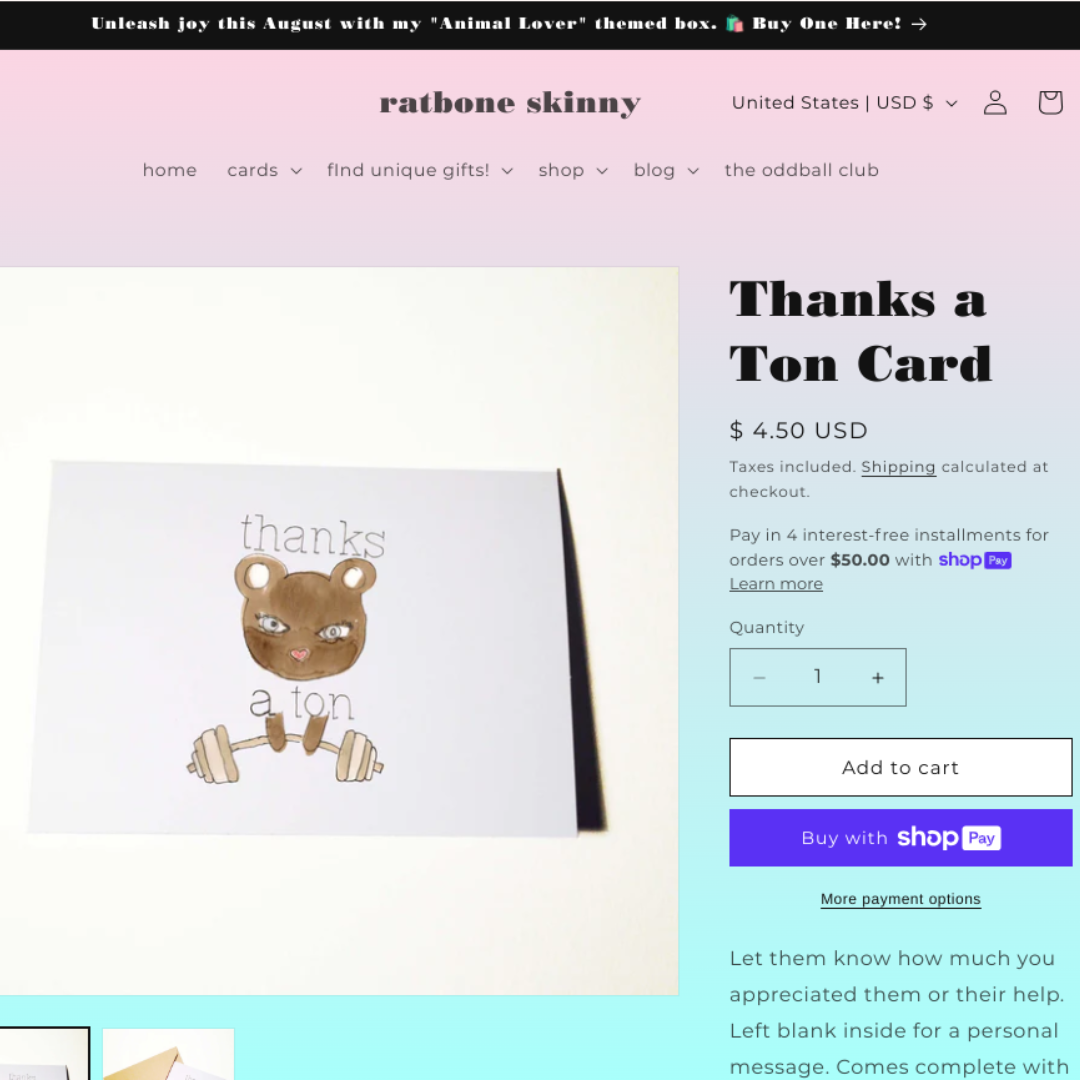
The minimalist layout focuses on
showcasing high-quality
product images.
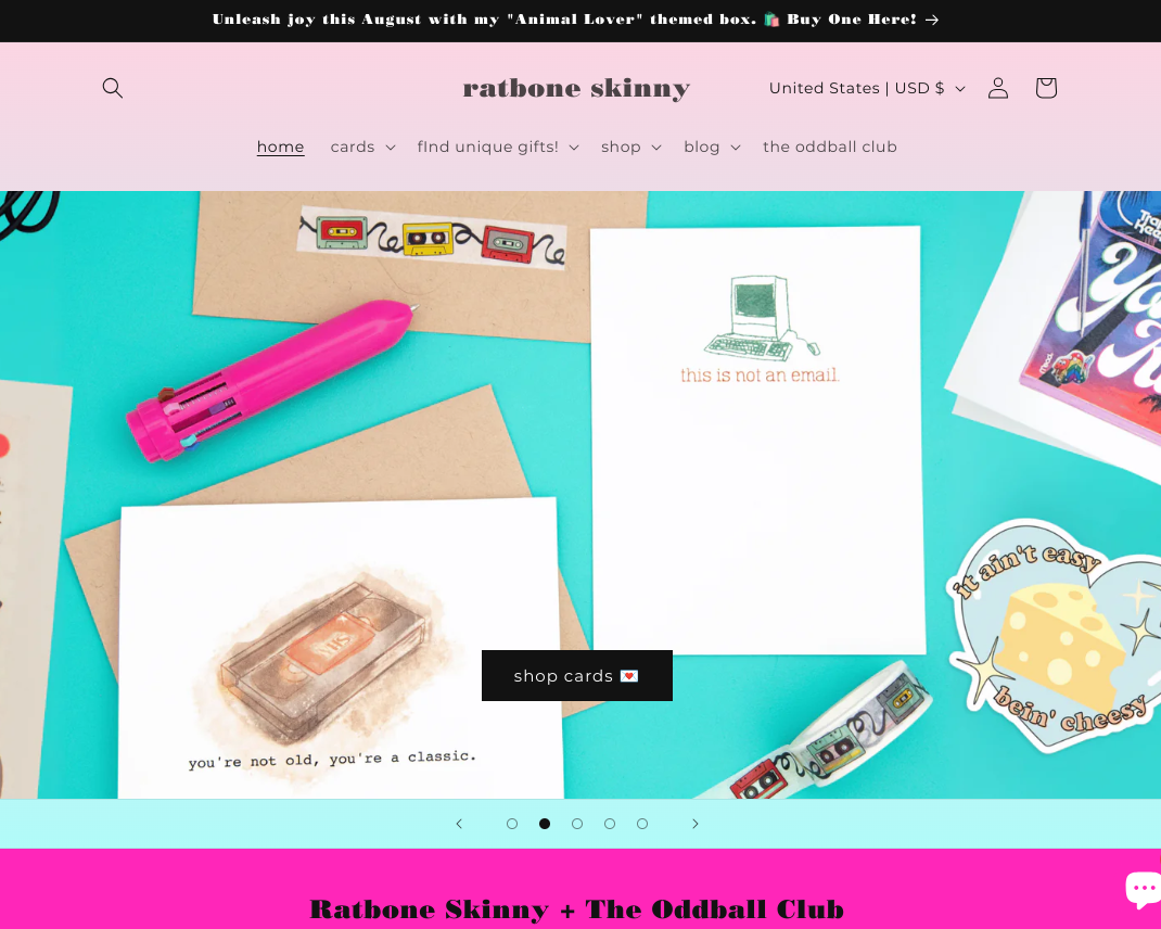
A full-width image carousel
with ambient animation
highlights featured products.
