Lo-Fi Wire-frames
Shopify Theme Editor
Adobe Photoshop
Adobe Illustrator
Research: Defining the brand's identity, target audience, and competitors.
Design: Creating wireframes, mockups, and the overall visual aesthetic.
Development: Using Shopify's theme editor.
Testing: Ensuring the design is user-friendly and functions correctly on different devices.
2020: Initial creation
2021, 2022, 2024: Iterate on design initiated with a focus on UX feedback and user-centered updates.
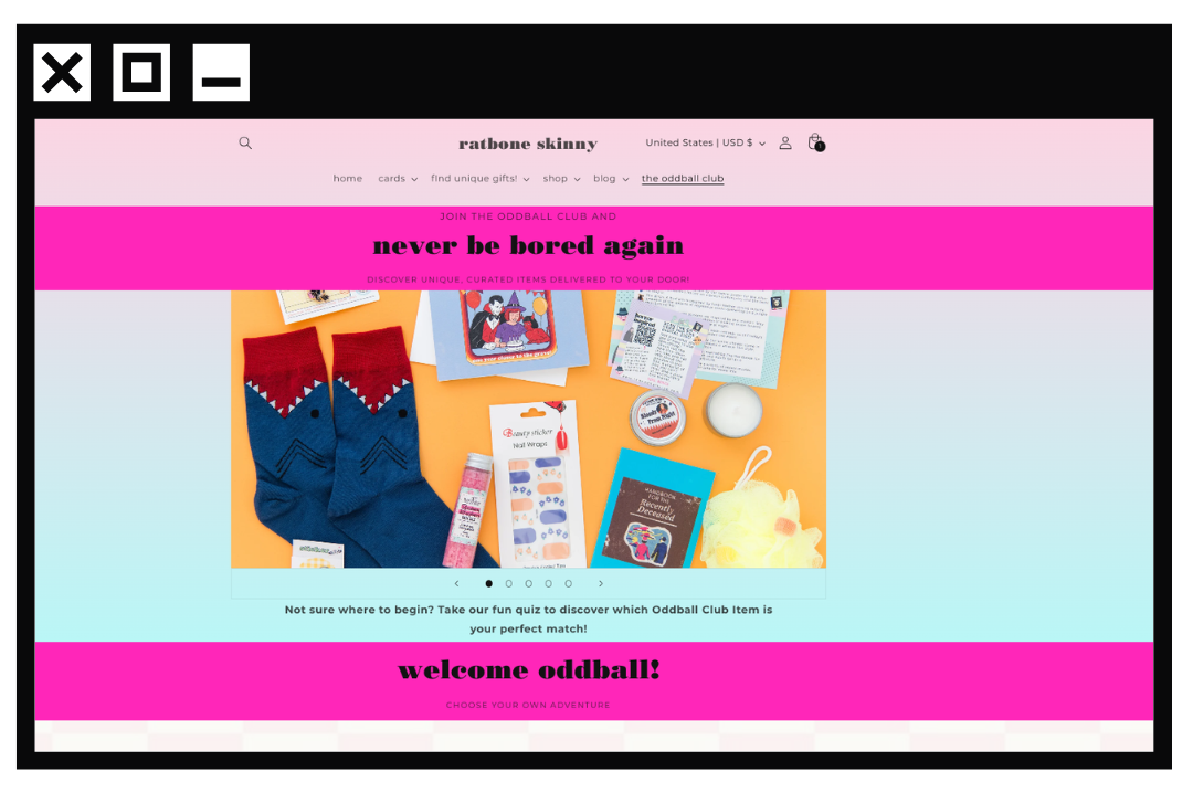
Wireframes and mockups of the landing page UI.
Brand Kit and Visual Identity.
Shopify Theme: Customized to incorporates design elements.
Documentation: Instructions or guidelines for maintaining and updating the theme.
The Oddball Club is a quirky and unique subscription box service that offers a monthly assortment of curated items. Its visual identity is characterized by a playful and eclectic aesthetic, featuring bold typography like Cooper Black and Courier Prime, vibrant colors, and whimsical elements like the Squrrile logo, which evokes a sense of quirkiness and fun. The high-quality and colorful subscription box photos with flat lay compositions further enhance the brand's distinctive visual style. This combination of elements creates a fun and engaging brand experience that resonates with its target audience.
The Oddball Club landing page features a clean and modern design with a visually appealing hero section that immediately captures attention. The bold black headlines, paired with the vibrant hot pink color, create a striking contrast and emphasize the key messages. Witty subheaders add a touch of personality and encourage users to explore further. The subscription options are clearly presented with scrolling, and the product showcase effectively highlights the unique and quirky items offered. The use of high-quality images and consistent branding throughout the page creates a cohesive and professional look. A clean and uncluttered design helps reduce cognitive load and makes it easier for users to focus on the important information.
To maximize user engagement and potential conversions, I strategically placed the Oddball Club subscription box link at the end of the navigation bar. This leverages the Serial Position Effect, a psychological principle that suggests people tend to remember the first and last items in a series better than those in the middle. By positioning the subscription box link at the end, I aimed to increase its visibility and encourage users to explore this unique offering.
This visually appealing and user-friendly design helps to establish the Oddball Club's brand identity and encourages visitors to explore further, ultimately leading to increased conversions.
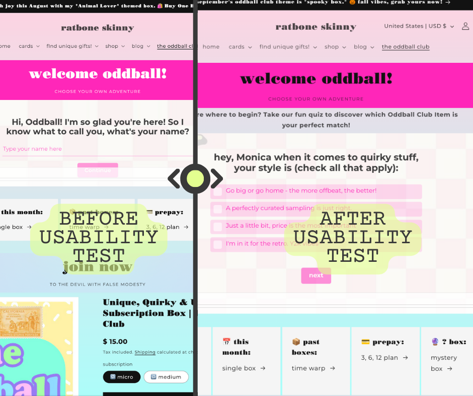
User struggled with white lettering.
Solution: Use black font for
high contrasts for accessibility.
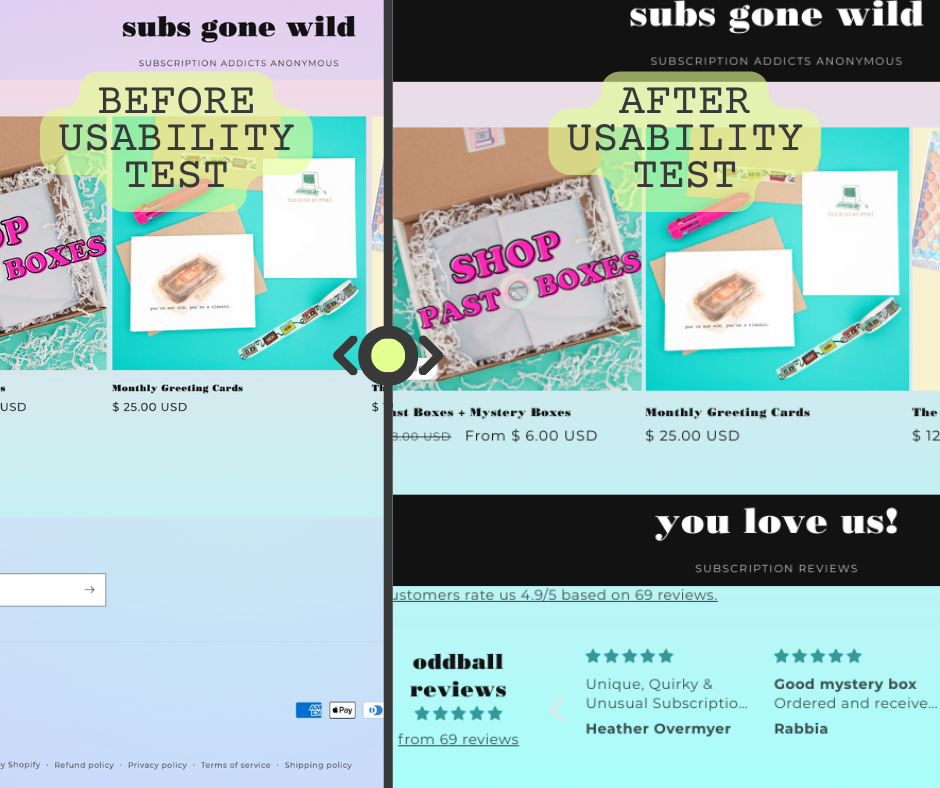
User felt that the landing
page could benefit from
customer reviews.
Solution: Include testimonials.
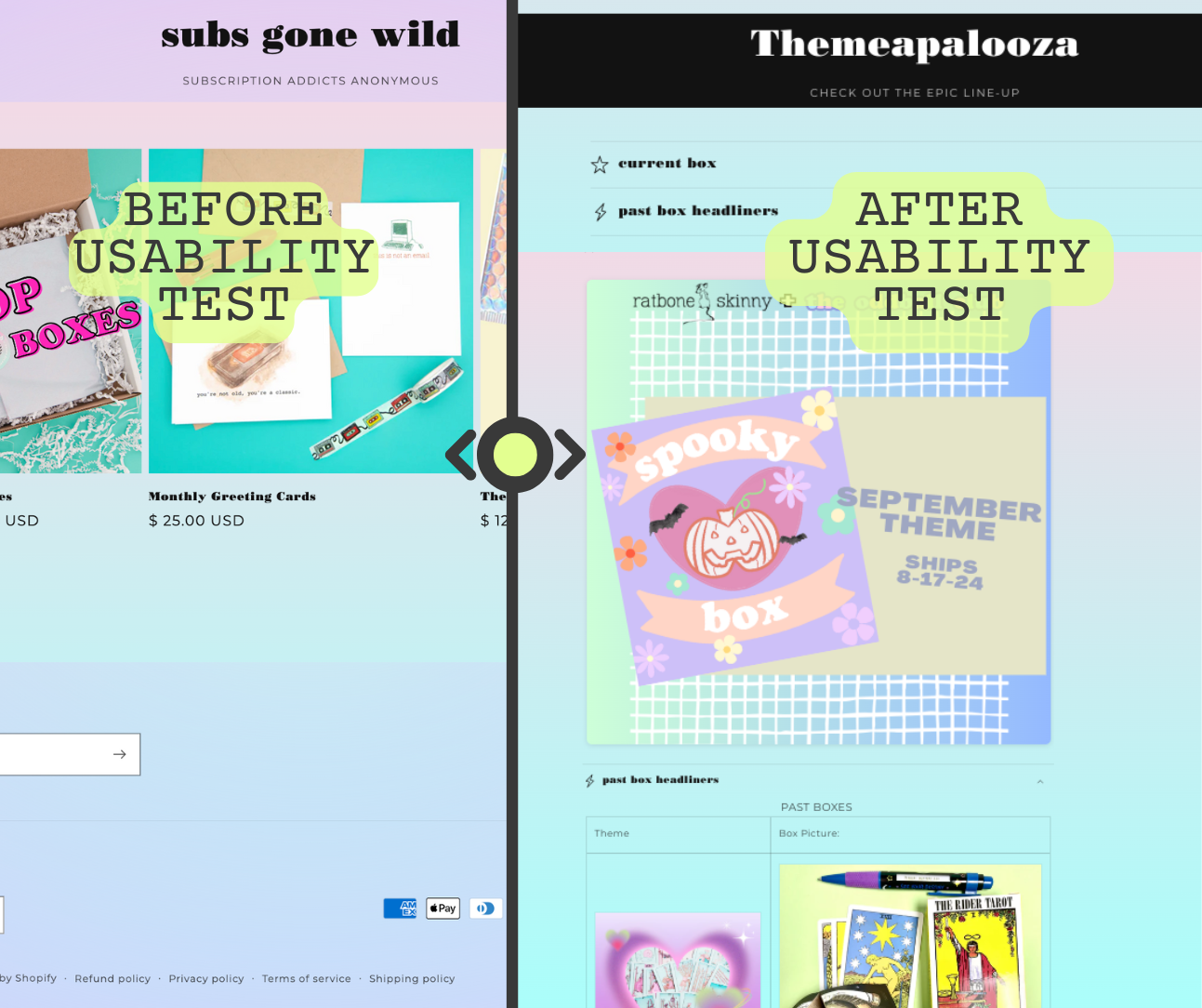
User struggled to find information
about past subscription boxes.
Solution: Added a "Current" and
"Past Boxes" accordian.
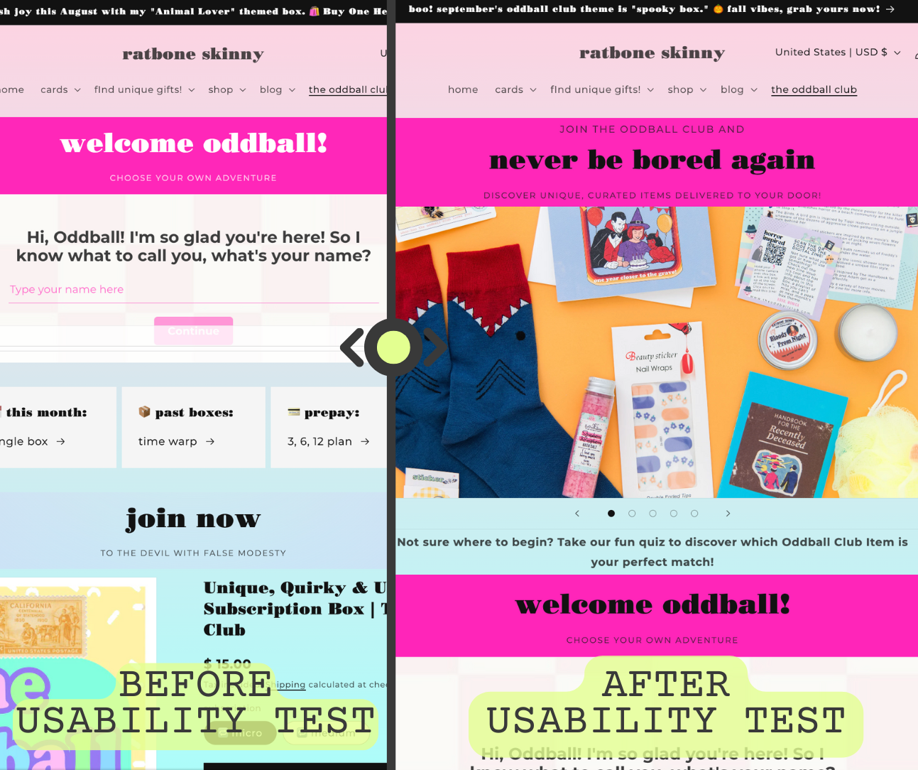
User didn't understand the value.
Solution: Add a prominent tagline to
"Join and 'Never be Bored Again'".

User struggled with white lettering.
Solution: Use black font for
high contrasts for accessibility.

User felt that the landing
page could benefit from
customer reviews.
Solution: Include testimonials.

User struggled to find information
about past subscription boxes.
Solution: Added a "Current" and
"Past Boxes" accordian.

User didn't understand the value.
Solution: Add a prominent tagline to
"Join and 'Never be Bored Again'".
Provide descriptive alt text for images to assist users with visual impairments.
Ensure that all users can navigate the interface using a keyboard.
Adhere to accessibility guidelines to make my design inclusive.
